How Can I Design my Own Business Cards
Ever taken someone’s business card only to find it so boring you swore you felt your soul quietly sigh? Let’s change that. Designing your own business cards is like writing a haiku about yourself—every element matters, and when it’s done right, people can’t help but pause and smile.
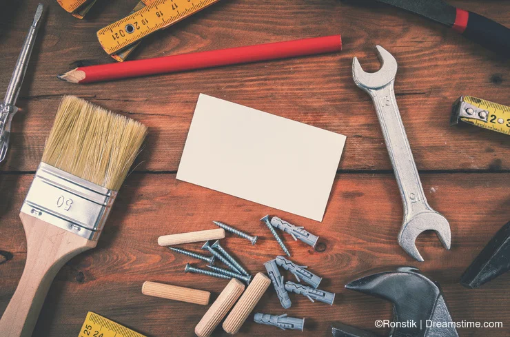
Designing standout business cards requires combining visual storytelling elements (composition, color palettes, typography), tactile print techniques (matte, gloss, uncoated), and professional image curation—aligning design choices with desired brand mood, usability in advertising campaigns, and application scenarios such as networking, editorial features, or content marketing collateral.
- Compose cards using shape variations (square, vertical, folded) and font clusters (serif, script, sans-serif) to capture subject mood or brand impression in editorial or portrait display contexts.
- Frame key content—name, role, URL—with hierarchy; retouch layout for optimal legibility and semantic recall, essential for advertising campaign handouts or business networking events.
- Apply advanced color-correct or grade techniques, matching brand tones (fiery, cool, monochrome) to natural lighting influences; test in multiple lighting setups for print fidelity.
- Capture tactile appeal through stock texture (matte, velvet, gloss); silhouette or backlight photo elements for business cards intended for product launches or commercial introductions.
- Iteratively refine and future-proof: update image attributes (contact details, color highlights), contextualize card designs for editorial use, influencer media kits, or cross-platform marketing handouts.
Here’s the lowdown on crafting cards that are informative, unmistakably you, and maybe even worthy of fridge-magnet status.
1. Dream First, Design Later
Before you fire up your design app, start with a mini daydream:
You’re at a networking event. The person across the table reaches out, you hand over your card—and their eyes light up. They actually read it! Maybe they run a finger over the texture or let out a little chuckle at your witty tagline. That’s the reaction you’re after.
Hold onto that feeling. It will guide every choice—from the shape you pick to the font you flirt with.
2. Think Outside the 3.5 × 2 Box
Standard cards are reliable, but sometimes reliability feels like beige carpeting. Consider:
Square (2.5 × 2.5″)
– Mood: Bold, contemporary
– Heads-up: Might require a custom pocket or stand
Vertical (2 × 3.5″)
– Mood: Fresh, poster-like
– Heads-up: Can look odd in a horizontal stack
Folded (double your canvas!)
– Mood: Storyteller’s delight—peek inside for more info
– Heads-up: Bulkier, pricier to print
Rounded corners or die-cut shapes
– Mood: Playful, tactile
– Heads-up: Extra die-cut fees
Pick a format that sparks joy and suits your field. A playful square might thrill a children’s book illustrator, while a sleek vertical might suit a corporate coach.
3. Content Hierarchy: Less Is More
A card is a handshake in paper form, not a novel. Here’s your must-have list, in order of importance:
Your Name (big enough to read across the table)
Your Role (photographer, graphic designer, CEO of Caffeine Consumption)
Contact Info
– Email (keep it professional—“coffee@domain.com” is cute once)
– Phone (make sure it rings!)
Website or Portfolio URL (tiny but present)
One Fun Bonus (social handle, QR code, or a micro-tagline)
Warning: Avoid “Instagram, TikTok, LinkedIn, Facebook, Friendster”—choose one meaningful channel or a single QR code that directs to a landing page.
4. Fonts That Speak Your Language
Fonts are the accent in your card’s “voice.” Mismatched accents can be jarring.
One statement font for your name or logo
One neutral font for details
Serifs whisper “trust me,” sans-serifs say “I’ve read a UX best-practices guide,” and script fonts flirt with elegance—just don’t let them flirt too hard, or your phone number becomes illegible.
5. Color & Contrast: Your Mood in Printing Ink
Draw from the hues you love in your go-to images:
– Fiery tones like reds and oranges when you need punch and personality
– Cool shades of blue and green to convey calm confidence
– Black-and-white or pared-down palettes for an elegant, no-frills look
And here’s the catch: lighting can lie. That electric teal you adore at your desk might look more like dull seafoam under office fluorescents—so always check your colors in the real world before you hit “print.”
6. Imagery & Texture: More Than Meets the Eye
If you’re a photographer, why not let a signature shot peek through?
– Edge-to-edge background: A subtle, low-contrast photo that whispers your style
– Spot image: A tiny icon—camera aperture, pen nib, or a stylized llama if that’s your spirit animal
Pair that with paper that feels as good as it looks:
Matte velvet for a soft, luxe feel
Uncoated stock for an organic, tactile vibe
Gloss finish for punchy, eye-catching color
A quick snag test: brush your fingernail gently across a sample. If it feels premium, you’re on the right track.
7. The Nerdy Bits: Print-Ready Specs
Design software and printers sometimes speak different dialects. Keep them in harmony:
Bleed: Add at least 3 mm on all sides so nothing accidentally trims off.
Color Mode: Work in CMYK—your screen’s RGB colors lie in print.
Resolution: 300 DPI minimum (no pixel party crashes allowed).
Outline Fonts: Convert text to outlines so your fonts don’t swap to Comic Sans on arrival.
Order a small test run—because discovering 200 cards are unreadable after they’ve arrived is a punch to the gut (and your wallet).
8. Feedback & Iteration: Embrace the Critics
Hand your prototypes to trusted friends, colleagues, or that brutally honest cousin. Ask:
“Is my name legible at a glance?”
“Do these colors feel like ‘me’?”
“Would you actually keep this card?”
Take notes, tweak mercilessly, and test again. Great design is a process, not a one-and-done.
9. Future-Proof (Without Chasing Every Trend)
A distinctive card isn’t tied to fleeting fashion, but every few years:
– Update details: New email, new phone number, new handle?
– Refine style: Fresh accent color, revamped logo, or a touch more minimalism
Consistency breeds recognition; small, thoughtful updates keep things feeling current without alienating your audience.
Final Flourish
So grab your favorite pens, dive into those stock-photo favorites, and let your imagination lead the way.
Sketch out wild ideas, print a handful of drafts, swap them with friends for feedback, tweak what feels off—and don’t stop until handing someone your card feels like gifting them a little piece of your story.
Even in our swipe-right world, there’s magic when someone holds a card and thinks, “This is something I’ll remember.” Make yours that spark.